Store Layout
To ensure you pick the perfect store layout for your space take a look at the various types of store layouts retail spaces uses to ensure customer flow and satisfaction. Your goal as a business owner is to utilize all the square footage of your retail space to ensure sales. Below we will discuss the various types of store layouts one may encounter when in a retail experience.
Straight
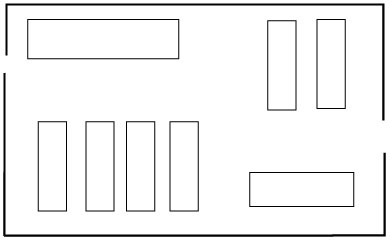
Straight store layout is similar to the grid layout. It is extremely common to see as it is simplistic yet efficient. Like the grid layout this form of layout is not enticing however is efficient and ensures easy movement for customer to move through the store to look at merchandise and then straight to checkout.
Loop/ Race Track
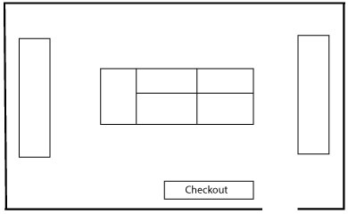
Commonly used with retailers guiding the consumer throughout the store in a loop or racetrack like manner. There is usually some form of direction guide given whether it be lighting, flooring, guiding lines/arrows or even signage. The use of this layout is specific for stores that do not want customers to physically engage with their merchandise or staff; just guide the consumer through the store with this loop.
Diagonal
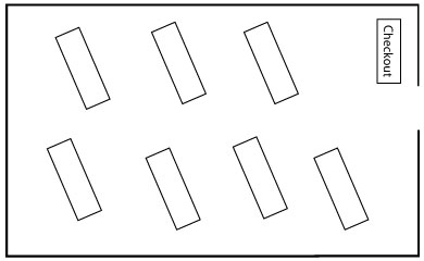
In a diagonal store layout the shelves and racks are all placed in a diagonal manner to show more merchandise to the customer and help guide them to checkout. It aids in the flow of the store to consistently ensure customer movement. This style of layout is also helpful in deterring theft as the employees have the merchandise and customers in eyesight at all times.
Angular
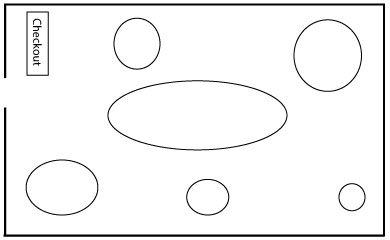
When seeing this form of store layout the consumer will notice the use of circular and rounded fixtures. This form of store layout uses the stores space in an inefficient manner. use of space however is suited specifically for the store’s target audience. Luxury stores tend to use this form of layout as they already have loyal customers who prefer to shop in spaces such as this.
Geometric
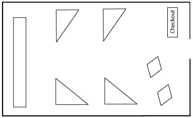
Typically used for Generation Z and millennial shoppers. This layout offers a unique shopping experience and artistic touches to not only the physical store but also their merchandising techniques. The shopper will notice their five senses being touched, architectural elements and cohesiveness within the stores to showcase the brands message and overall identity. Think Urban Outfitters, Anthropologie etc.
Mixed
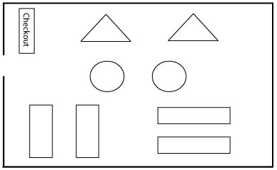
Mainly used by department stores and some grocery stores. The use of this layout enables the consumer to flow through the store and see a variety of merchandise ranging from home decor to makeup in a cohesive yet interesting manner.
Free Flow/Boutique
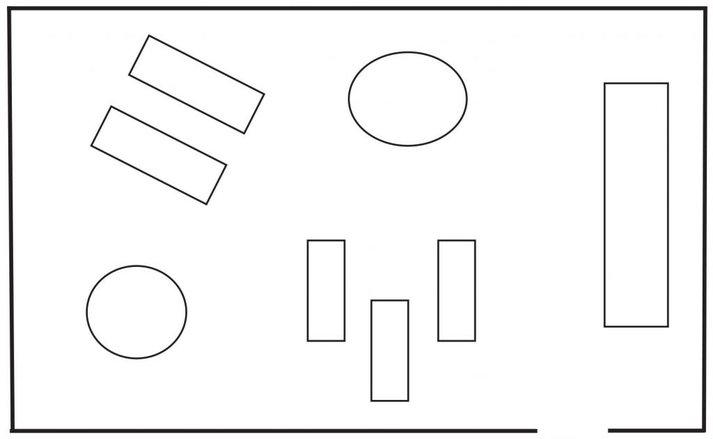
This type of store layout is where you have your fixtures and merchandise placed with no clear path in sight. It allows your customers to take their time while browsing and shopping through your store.
Grid
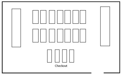
The most commonly used in retail design due to the fact it is the most efficient use of space. It is most commonly used in drugstores and hardware stores where there are simplistic fixtures and ensures consistency and uniformity amongst all stores. The checkout is usually towards the front and the shoppers can usually go up and down rows with matching setups throughout the world. All stores are uniform and in essence do not promote any individualism to the customer as in other store layouts showcase.
Forced Path
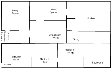
This store layout guides the customer through a one way only type path. It is forcing the customer to follow a predetermined path set by the store. This form of store layout maximizes the store space to ensure the most sales. An example of this use of store layout is Ikea and how you enter through one point of entry and are guided step by step through each space.


