How to Display Shoes in Store
The global footwear market is a multi-billion dollar industry. When it comes to footwear spending, Americans hold the number one spot, investing over $100 billion on footwear in 2021 alone.
The average consumer owns twenty pairs of shoes, six of which are sneakers. America’s obsession with shoes offers great financial opportunities for retailers.
The footwear market is highly competitive. Online stores, retailers, designers, and manufacturers are all fighting for their share of profits. As a retailer, determining the best way to display your shoe inventory is challenging. They are small and come in a variety of shapes, sizes, and colors.
Are you ready for the good news? There are a number of strategies and solutions you can use to display your store’s footwear. The right display will serve as an extension of your sales team, driving more consumers and boosting profits.
First, we’ll discuss the value behind designing creative shoe displays. The, we’ll move on to some handy organizing shoe ideas.
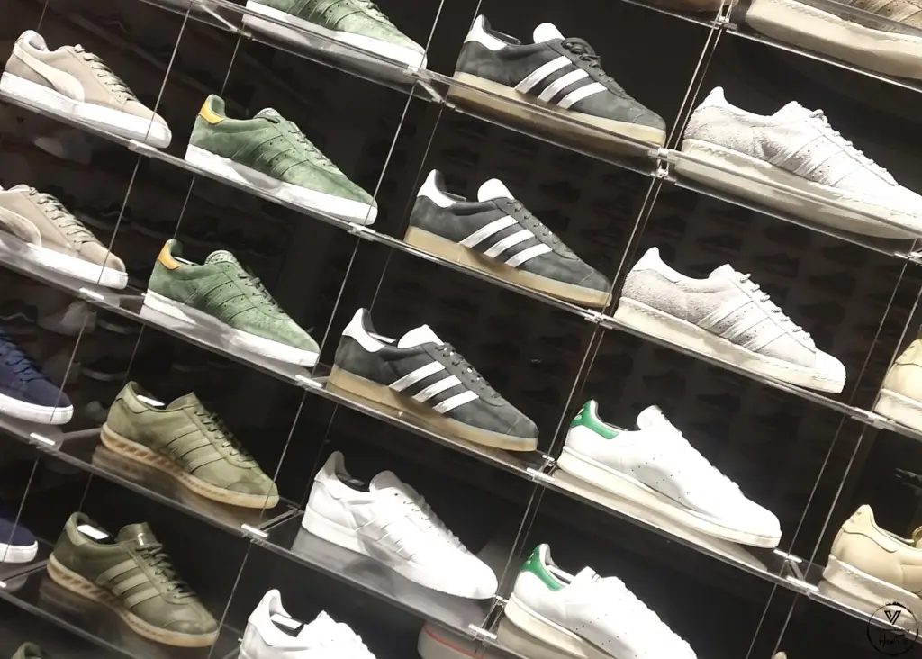
What Are Store Displays Called?
Store displays, also called retail displays, are what you use to promote your products. Display tables are essential promotional tools. They lure consumers into the store, promote your store, and provide something aesthetically pleasing for the customer to look at. Retail display tables are also a great way to protect your inventory and keep your shoes organized.
Studies indicate that consumers form an opinion about a store within 10 seconds. That gives you 10 seconds to lure them in and hook them. So, your ability to create an eye-catching retail display can mean the difference between making a sale or losing a customer.
How Do I Create a Visual Shoe Display?
To create an effective display, it’s important that you understand the basics of visual merchandising. Also known as VM, visual merchandising is the practice of creating stunning displays that appeal to the consumer’s senses. It attracts, engages, and motivates them to make a purchase.
The five elements of effective visual merchandising are:
- Size – The largest objects should be placed on the display first.
- Balance – Create asymmetrical balance, rather than symmetrical.
- Color – Certain colors evoke specific feelings and emotions.
- Focal point – Where everything comes together, including signage, props, shoes, and the store’s background.
- Simplicity is key – You are trying to attract the customer’s attention, not overwhelm them. When it comes to displaying shoes, less is more.
An effective store display is eye-catching, tells a story, and stays on-brand with the rest of your store. Let’s take a look at a few strategies you can employ to design effective displays.
Sell the Complete Picture
When a customer purchases a pair of shoes, they aren’t just buying the footwear. They picture themselves wearing them. They’re dressed up for a dinner party or sunbathing on a beach.
A good retail display helps them complete the picture. For example, if your store also sells apparel and accessories, pair the shoes with an outfit and clutch. If you have bathing suits on display, why not complete the look? Adding a pair of shoes and a cover-up could influence the customer to purchase more than they originally intended.
Color Psychology
Color psychology has long been a hot topic in the marketing industry. Some colors evoke feelings of comfort, while other colors bring out feelings of hostility. In fact, some cultures practice chromotherapy, which is the use of colors in healing.
Now, we aren’t saying you need to become an expert in color psychology. But this is something to consider when creating your displays. Pairing the right colors together can attract attention and lure in shoppers.
Display Shoes by Style
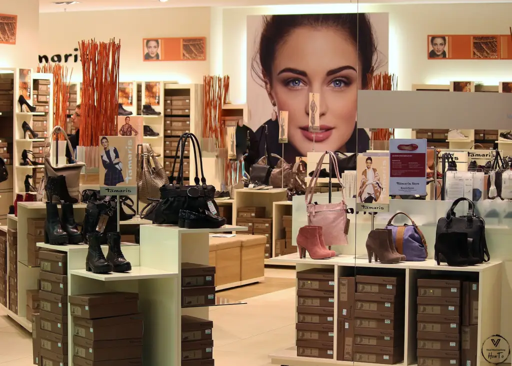
Displaying shoes by style is another great way to show off your inventory. Use a variety of display racks, including shoe stands, shelves, towers, gondolas, and risers.
Before positioning your displays, walk to the front of your store. Take a look around you. How does traffic flow? What are the focal points? Having the big picture helps get into the customer’s mind and see what they’re seeing. Use this insight to help with the placement and design of your shoe displays.
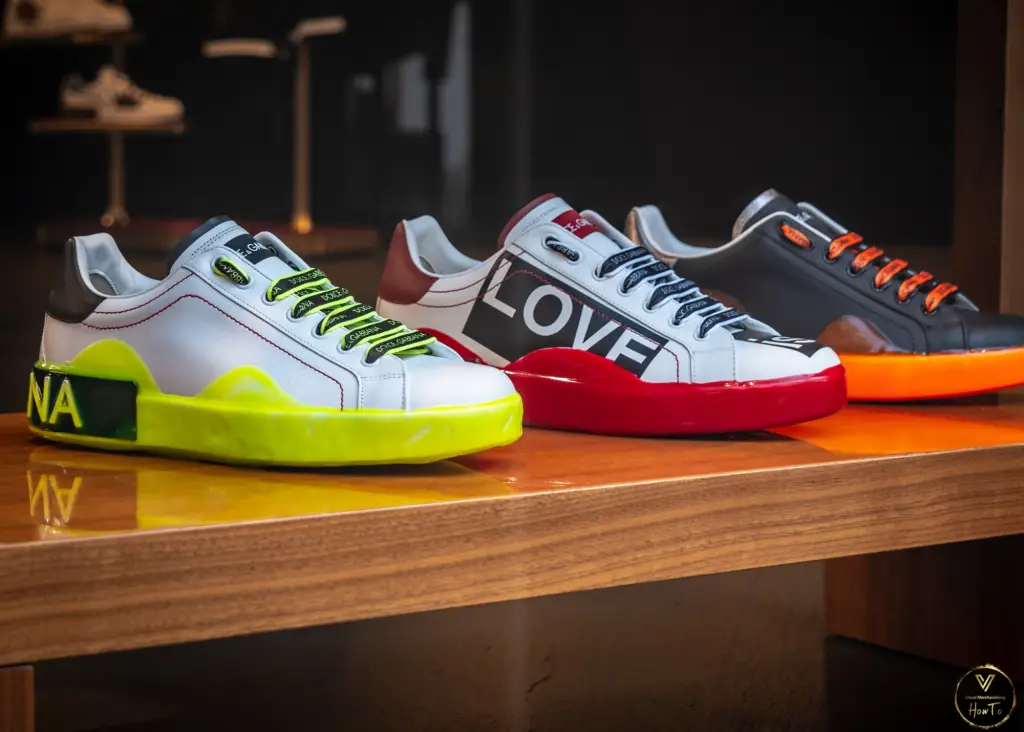
Visual Merchandising Best Practices
Designing visually pleasing shoe displays is daunting. The reward, however, makes it worth all of your hard work. To help you get started, we wanted to share some visual merchandising best practices and key takeaways.
Pair products together. This is not only aesthetically pleasing, it helps influence the customer into impulse buys.
Use accent lighting to make your displays stand out.
Change your displays and windows frequently. This gets customers excited and gives them a reason to stop in.
Combine accent lighting with blocks of color. This creates a focal point, turning the customer’s attention towards the products you want highlighted.
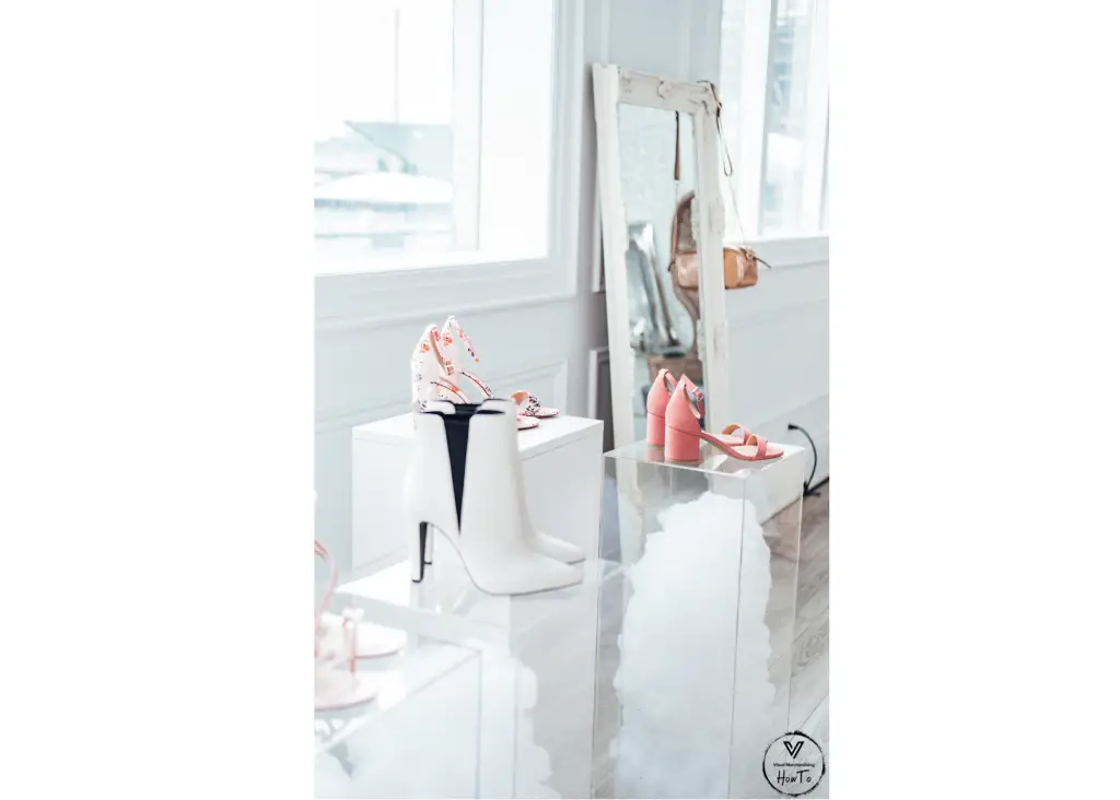
Using signage on your creative shoe displays engages the customer. Try not to be too wordy with your messaging. The “blink test” is a great way to ensure your message isn’t too distracting.
Don’t forget to price the items. If a customer picks up a pair of shoes, and it doesn’t have a price, you’ve taken the impulse out of impulse buying.
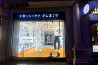
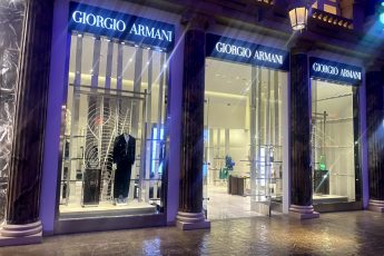
Window displays are one of the most effective ways to draw in the customer.
Regular cleaning and maintenance are important. Your store’s displays are a direct reflection of your brand. If fixtures are broken or dirty, or a mannequin’s outfit is disheveled, this will have a negative impact on your brand and the bottom line.
After you finish designing a shoe display, take some photos. Document sales, as well as customer reaction and engagement. Keep a log of all past displays, so you know which ones were successful and which was a flop.
Other Key Terms:
- Shoe display ideas for shop
- Footwear display stand or shop
- Shoe display ideas for home
- Shoe display ideas for bedroom
- Shoe wall display ideas


