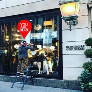
How to Create an Attractive Visual Store Display
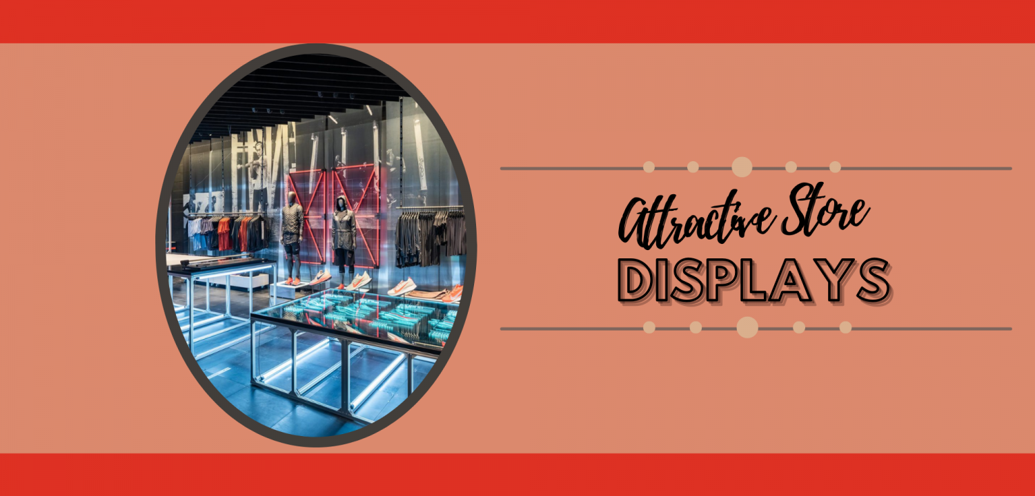
Showcasing your merchandise in an attractive manner in your store visually attracts customers from a distance and encourages them to buy without much convincing. It encourages repeat sales and brand loyalty. An attractive display of products at the store compels and captivates customers and brings up the urge to buy.
You can use a good display as a strategy to announce an ongoing or incoming promotion, announce new stock arrivals and promote slow moving merchandise. An attractive visual display allows you to effectively communicate to your customers visually before and after you engage verbally with those customers. It allows you to focus more on offering a high level of customer service in order to maintain client retention and satisfaction. These are just a couple of the benefits of having an effective and attractive visual store display.
The customer’s buying process begins when they decide to enter your store. Therefore, an attractive window display with effective signage is essential increase traffic flow and sales in your store.
Stores with one or more windows maintain an advantage than others since they can use both windows for to create eye-catching displays that attract more customers from a greater distance. This has been proven as a successful and less expensive way to advertise and showcase ones products.
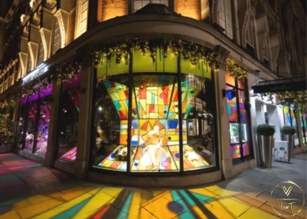
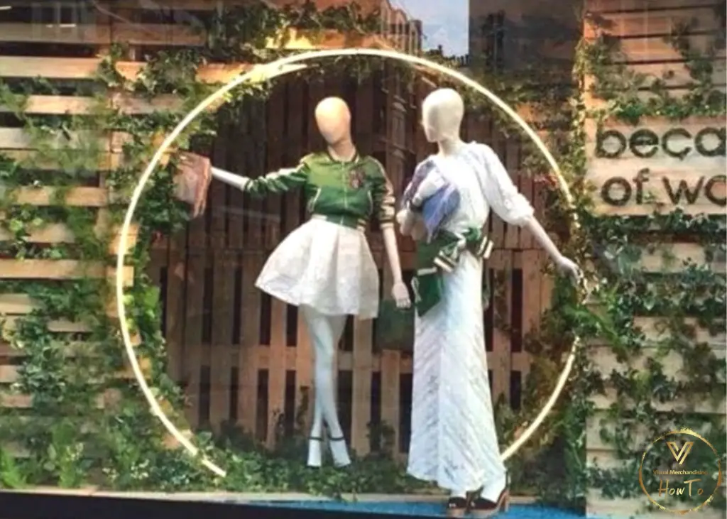
For stores that do not have the privilege of using windows for this purpose they can opt to showcase merchandise by utilizing their store layout to the fullest by installing windows, creating themed displays, adding in shelving, and utilizing interactive displays
Apart from creating window displays you can utilize other space within your business create displays to merchandise your products. Where do you start you may ask? Let’s briefly discuss a solution to this question below.
How about you start by standing at your store entrance? Do you get attracted by any of your products? Which side of your store draws the attention of your customers the most?
If your customers get the same experience when they walk into your store then you will be able to conclude that your merchandising shall be successful for your business. Look out for areas to improve on and maximize on the store’s strengths, weaknesses and focal points of displays.
An attractive visual merchandising display is all about the look of your store, how customers feel when they walk in or walk around your store and the brand perception. So how do you create an attractive display for your products at the store? You can use the tips below to help you achieve that.
In order to understand your customers’ buying habits and influence their perception of your products, you need to incorporate some design elements, which include but are not limited to: promotional displays, furniture placement, floor plans, lighting, color and patterns.
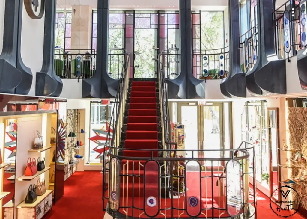
So what are the factors to consider in creating an effective merchandise display?
Let’s take a look below into a list of some items that can contribute to the overall success of any display you are merchandising.
- Time: Plan on giving enough time to prepare and execute your display.
- Theme: Settle on a theme for your store display, which resonates well with your brand and industry too.
- Budget: Determine your budget for the project and work within your means.
- Visually see your display: Put your display sketch on paper or in CAD. You will use it as guide to your project implementation.
- Deadline: Set a timeline and deadlines for the project
- Toolbox: Get your merchandising tool together (See below)
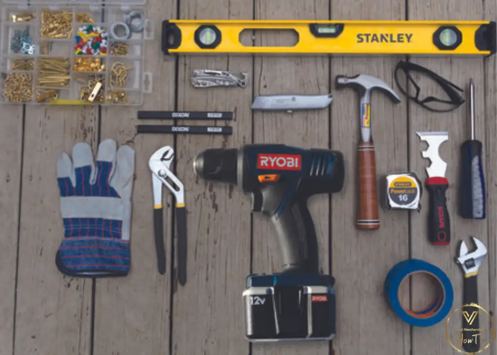
First, you will need a merchandising toolbox before you design your store display. The toolbox contains the following items below:
- Toolkit with screws, hammer, screw driver and nails
- Scissors, two sided tape, stapler and pins
- Utility knife / Razor blade
- A glue gun and hot glue sticks
- Tape measure
- Paper towels/ glass cleaner
- Monofilament finishing line
- Notepad, marker and pencil
- Sign holders and signage
- Props- Non-merchandise items

Elements of an effective visual merchandising
The Elements of an effective visual merchandising include but are not limited to lighting, simplicity, arrangement, landscaping, texture etc. These elements will be used in conjunction with visual merchandising design principles to provide an effective merchandising display which attracts customers.
Lighting
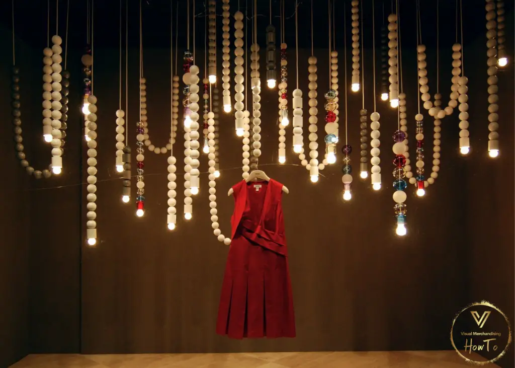
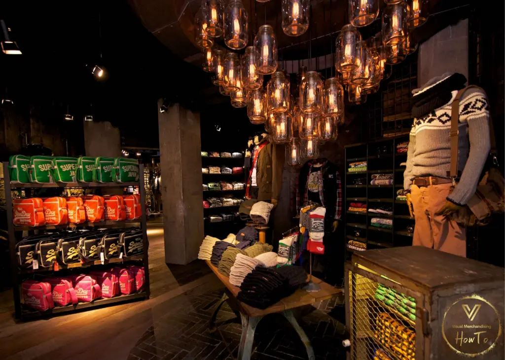
The lighting in your store brings colors to life and highlights the best features of your products. You can play around with different lighting features to create the ambience that you want for not only your store but also any display you create.
Accent lights draw customers’ attention. These are most commonly used for highlighting new products or those that are on sale. They work well in retail stores that sell luxury items. One key point to pay attention to with lighting is if there is a glare, uniformity or contrast created by adding in light.
Arrangement & Simplicity
Arrange the merchandise according to their sizes; the largest items should come first in the display and small items come last.
To maximize on display, consider a circular store arrangement, which is more efficient than having isles in the store. Why you ask? It exposes the client to a wider variety of products in the store and highlights the focal point in better manner.
Along with arranging items appropriately one should maintain simplicity in your display. In addition, too many details can make the store look too busy. Avoid overwhelming your clients’ visuals by maintaining simplicity.
Color
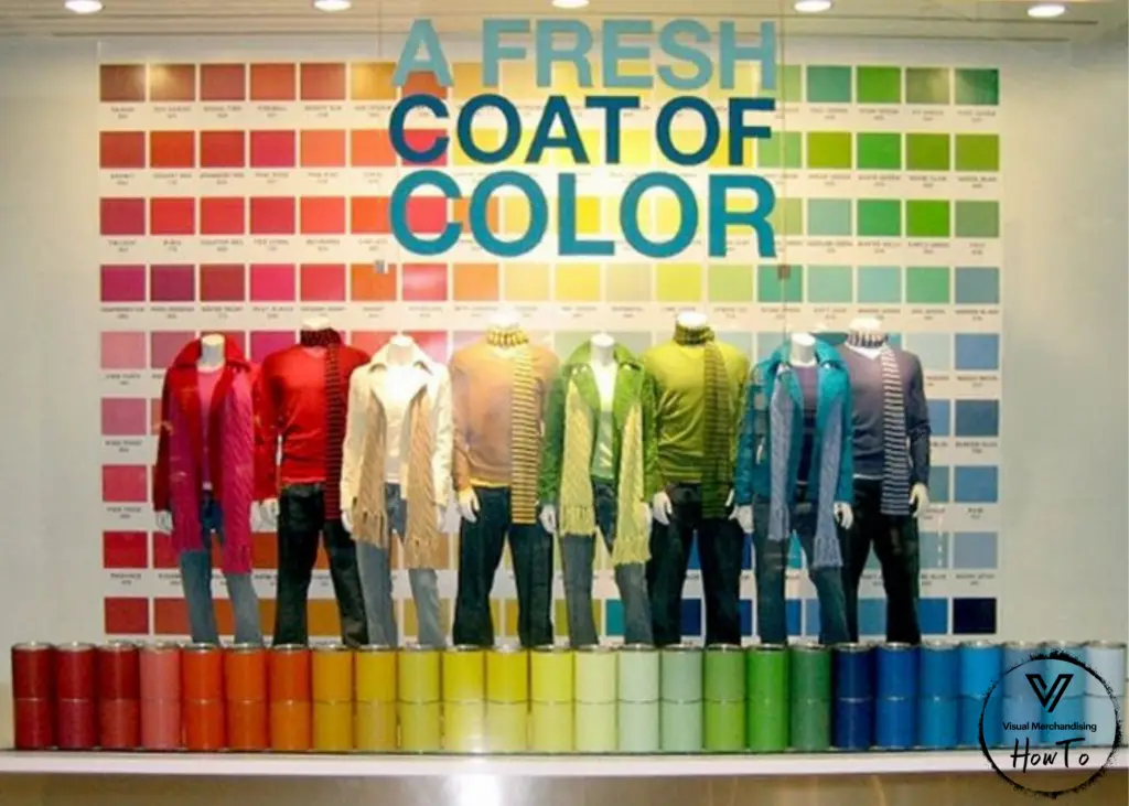
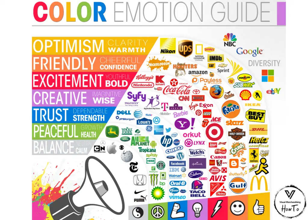
The choice of color represents a very important element of visual merchandising. Human beings are related to colors. Pick a color that will set the best mood for your business. Different colors evoke different emotions. The choice of your colors should depend on your brand identity, target audience and business goals. To attract your customers’ interest and boost sales, create a welcoming environment by use of colors that are bold, glamorous and beautiful. Examples of such colors are red and orange, which are attractive to the eyes and exciting to clients.
Do you know of colors that are specific to your industry? Use a base color in your branding and settle on a color that will stand out in your marketing campaigns.For instance, if you would like colors that radiate a productive, creative, trustworthy and imaginative vibe, a mix of blue, yellow and purple colors will serve the purpose. You can use dull colors to create sophistication.
To make different products stand out, place a product with a neutral hue in front of a strong background. This will attract customers’ attention to it.
Avoid making the store visuals too busy. Do not use too many colors that contrast, they will overwhelm the customers. Remember the end goal is to achieve an attractive display that serves as a selling point on its own. Keep in mind that there are different types of colors and their aesthetics postulates that determine which types of colors should or should not be mixed.
Typography
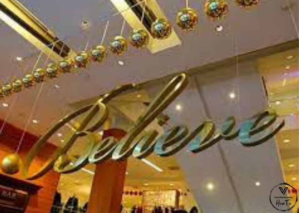
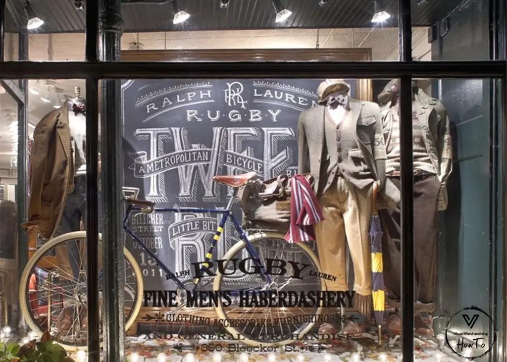
Make sure your spelling and grammar are on point. Poorly written signs, banners and price tags in your store trigger negative emotions with your customers, make you appear unprofessional and untrustworthy. This can lead to loss of sales and interest in you company. Keep your font size consistent. Use typography the aligns with your brand image and expresses your message appropriately.
Landscaping
This involves elevating the prime products to ensure they stand out. It is used to highlight certain products and to capture customers’ interest. Achieve Balance with the display by opting for asymmetrical instead of symmetrical arrangements. Asymmetrical arrangements creates products flow and movements.
Landscaping captures your clients’ attention. It allows you to be free with your creativity. Three tips for this element of creating an attractive merchandising display are vertical, lateral and longitudinal.
Landscaping helps to add more dynamics into your visual presentation. It allows you to manipulate the products display and create a perfect outlook.
Texture
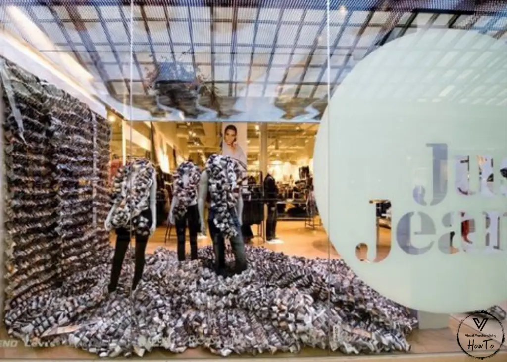
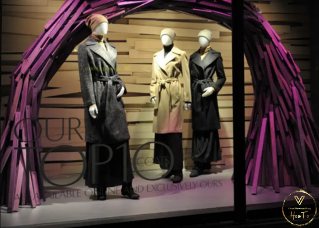
Different textures enable you to highlight aspects of your products. Settle on a texture that will create the outcome that you want. You can use texture to create a joyful or elegant vibe or one that resonates best with your niche or whatever it is that you want to offer your clients.
Research on your industry trends is crucial in terms of knowing what color and textures will captivate your audience and resonate with.
A grainy texture grabs more light and creates a warmer atmosphere. Flat texture gives out a much lighter vibe. It portrays enthusiasm. By using different textures, you can strategically highlight the main products of your display and make them easier to be noticed by your clients.
Storytelling
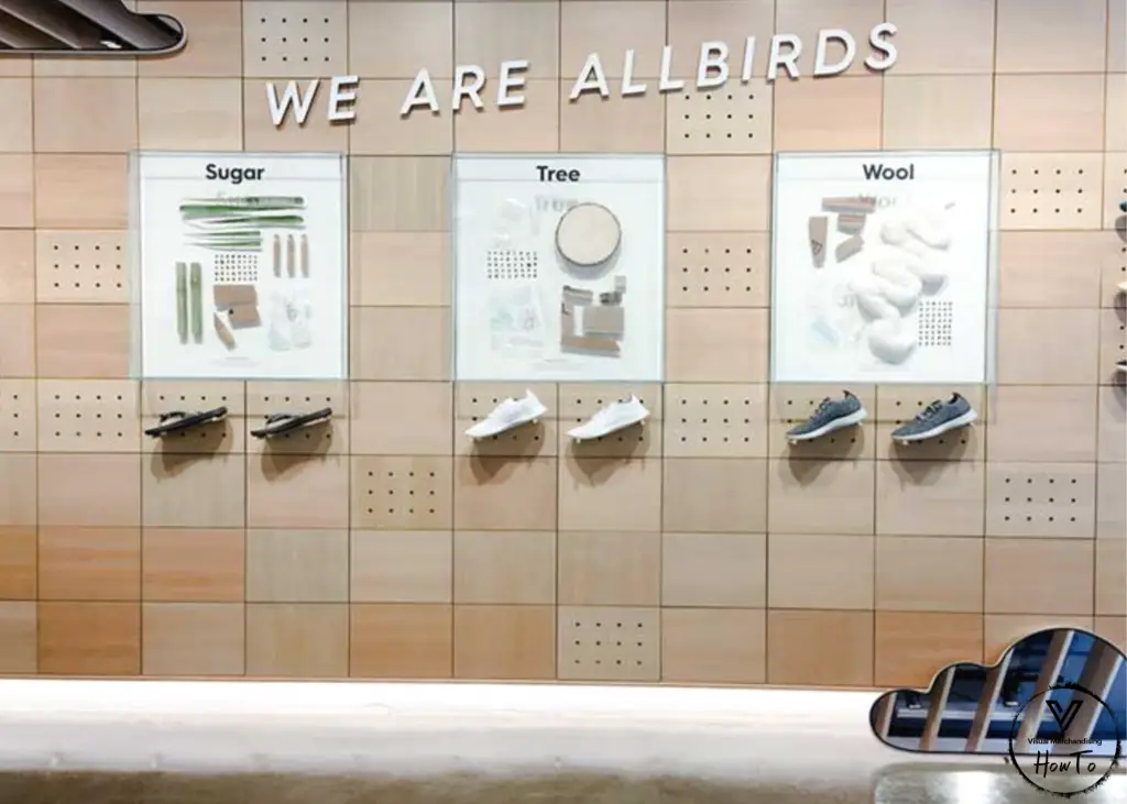
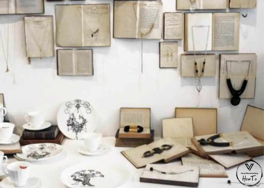
Use of a powerful story that enables sales can improve the visual display and educate the customers on the benefits of buying the displayed products. You can achieve this by understanding your customer better which in turn triggers them to buy.
Empty spaces
Every store has some underutilized spaces. These include empty spaces, empty shelves or the area between the ceiling and the displayed products. These spaces can be used to display information about your brand, your products or even display clients’ reviews.
Signage
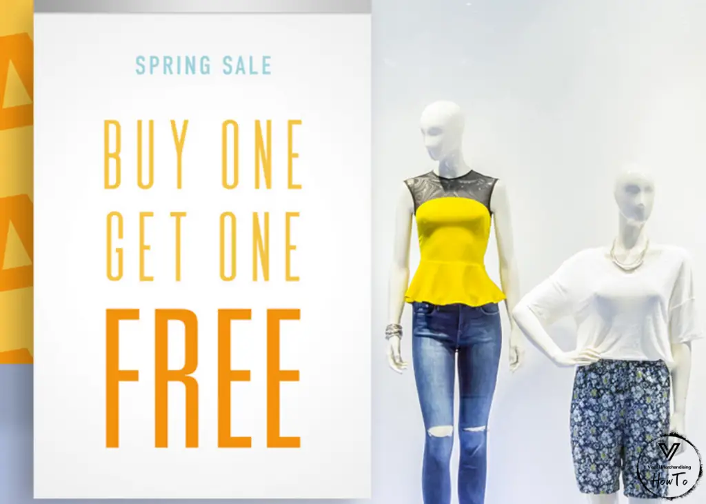
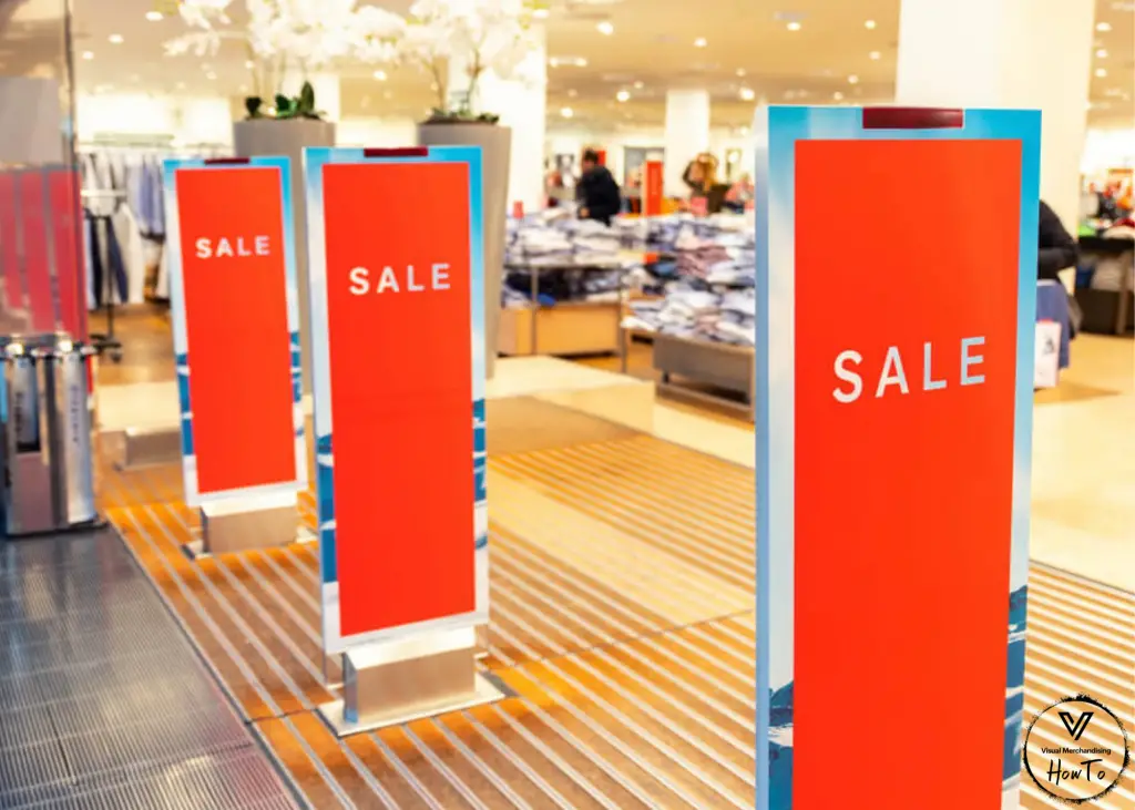
How do you feel when you walk into a store and all the store attendants are busy? Do you enjoy waiting and not finding what you need? When customers get that experience at your store, you can rest assured they are likely to leave the store with a very negative impression. You are likely to lose sales, customers and receive negative reviews, especially on your customer service.
How about you try incorporating store signage for your customers within the store. That way they can use these signs to point out their preferred sections even without asking for help. Digital signage (use of screens) keeps customers engaged and attracts customers into your store. Having visual signage is not only helpful but quite memorable for your customers. Your customers in turn will become return clients and remember your brand.
Digital signage promotes your brand’s image, message, values and culture. Visuals entice and attract customers. Ensure your signage has customer-focused messages that does not over complicate your message as that will lose your customers attention.
You can use signage to communicate key messages to your customers as well as showcase multiple brands that you offer. Signage can make or break the display; which is why it is crucial to ensure you use the correct signage for your business.
Focal Point/ Point of Focus
Where does your customers’ focus fall? Do they focus on a specific location on the display? Are they confused on where to look? Examine your display from your customers’ point of view and get a feel of exactly what they experience. Check your display to ensure your customers can easily view the hotspots and merchandise.
This is where the products, props, signage and background come together. Create a focus point that captures your customers’ attention and interest. This can increase your sales dramatically. Ensure this area is well visible and the merchandise here is placed in an engaging and attractive manner.
Decor
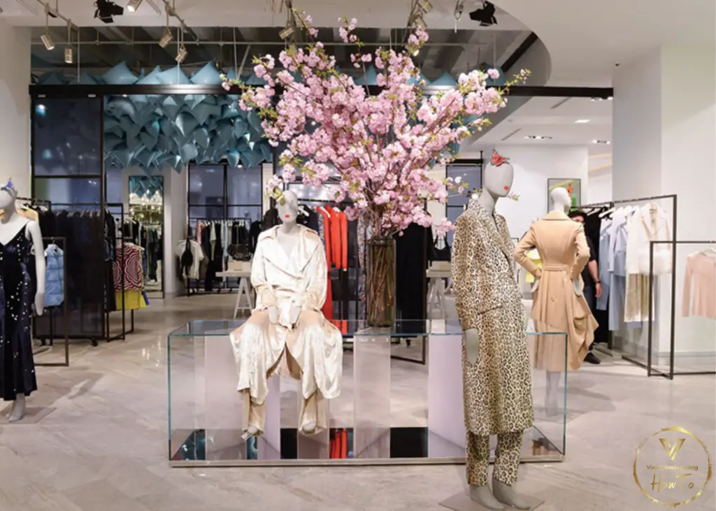
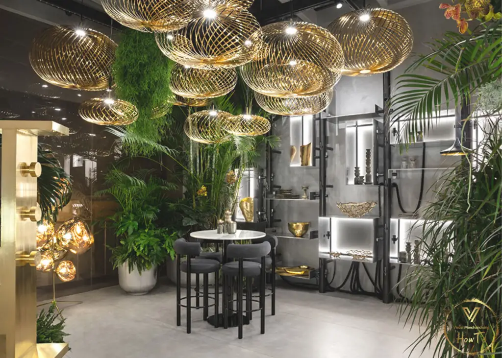
This includes furnishing the store and adding decor pieces. A good décor should enhance the overall display, your theme, and color choices. Décor enriches your display, creates some personality and grasps the attention of your customers.
Do not overflow the merchandise and know your limits. Different types of décor can be used to diverse purposes. Floral elements inspire freshness. Wood, gold and dark metal invoke the feel of elegance and style as well as quality. Décor adds value to your brand and products.
By this point, you should have your attractive display ready. Take photos of your beautiful work and save it for reference. Observe the customer traffic at your store, keep the records of the sales and compare with the previous records. Which period has better sales records?
You can ask for other people’s opinions and compare ideas. You can use the project as a reference point when you need to re-create or redo the store display. Props allow you to connect to customers’ other senses apart from sight.
Visuals influence clients’ decision-making. Understand your brand and create and interior and exterior that creates a memorable experience for your customers. In order to create a visually appealing experience for your customers, you have to take into consideration all the elements of visual merchandising.
Conclusion
In conclusion, the human brain is wired to react to different stimulants. Our decision-making process highly depends on visuals. This makes the visual aspect of merchandising essential to retail stores and to the success of any businesses.
what involves preparing and placing attractive displays of a new product
Frequently Asked Questions:
- What are the 4 basic types of displays?
- What makes a display attractiveWhat are product displays?
- What helps in the attractive display of the products at the store in order to increase their sale?
Other Key Terms:
- Sales promotion involves preparing and placing attractive displays of a new product
- Visual Merchandising
- Visual merchandising and display
- What makes a good display
- Product display in retail store
- Visual display
- Elements of visual merchandising
