Focal Point in Visual Merchandising
Visual merchandising is a marketing strategy used by retailers to enhance the in-store experience of shoppers and create a memorable impression. One of the essential elements of visual merchandising is creating a focal point. A focal point is a central area or an object in a store that immediately draws a customer’s attention.
Here are some tips for creating an effective focal point in visual merchandising:
- Use bold colors: Bright and bold colors can catch the attention of passersby and draw them into the store.
- Create height: Use tall or vertical displays to create a sense of height and draw the eye upward.
- Use lighting: Lighting can be used to highlight a particular product or area, creating a sense of focus and drama.
- Use props: Props such as mannequins, signage, or other items can be used to draw attention to a particular area or product.
- Create a theme: Creating a theme or a story around a product or a display can make it more interesting and engaging for customers.
- Use technology: Interactive displays or screens can be used to create a sense of movement and interest, drawing customers to a particular area.
- Make it visually interesting: Use unique or eye-catching materials, textures, or patterns to make the focal point stand out.
Creating a strong focal point in visual merchandising is essential to capture the attention of customers and increase sales. By using a combination of color, height, lighting, props, and technology, retailers can create a memorable and engaging experience for their customers.
What is Visual Merchandising?
Visual merchandising refers to the process of presenting products or services in an attractive and enticing manner in order to encourage customers to make a purchase. It involves the use of various display techniques, such as lighting, props, signage, and product placement, to create an appealing shopping environment and enhance the overall customer experience. The goal of visual merchandising is to increase sales and customer loyalty by showcasing products in a way that engages and inspires customers.
Merchandise Display
A merchandise display refers to the arrangement of products and items in a way that is visually appealing and attractive to customers. It is a visual representation of the products that a store or business is selling, designed to catch the attention of potential customers and draw them into the store. The goal of a merchandise display is to showcase products in a way that maximizes sales and encourages customers to make a purchase. A good merchandise display will highlight the unique features and benefits of each product and create a sense of urgency or desire in customers to buy.
What is a Focal Point in Visual Merchandising?
In visual merchandising, a focal point is a specific area or element within a display that is designed to draw the viewer’s attention and generate interest. It is often used to showcase a particular product or theme and create a strong visual impact. A focal point can be created using various elements, such as lighting, color, texture, shape, or movement, and is usually placed at eye level or in a prominent position within the display. The goal is to make the focal point stand out and encourage the viewer to engage with the display and explore further.
Departmental Transitions and Visual Hierarchy
Visual Hierarchy
Visual hierarchy is the arrangement or organization of visual elements in a design in a way that suggests importance or guides the viewer’s attention. This involves placing important information or elements in a prominent position, using color and contrast to differentiate between elements, and creating a clear and logical flow of information. The goal of visual hierarchy is to make it easier for viewers to understand and navigate the design, and to ensure that the most important information or elements are noticed first. It is commonly used in various design fields, including graphic design, web design, and visual merchandising.
Departmental Transitions
Departmental transitions refer to the area or section where one category of merchandise in a retail store changes to another. It is the point where customers move from one department to another, and it is a critical part of the overall store layout and visual merchandising strategy. Departmental transitions are typically marked by signage, change in floor covering, and/or a change in the type of merchandise being displayed. Effective departmental transitions can help guide customers through the store and encourage them to explore different sections, ultimately leading to increased sales.
Art and Science of Displays
Visual merchandising is the art and science of creating visually appealing displays and designs to attract customers and increase sales. A well-planned visual merchandising strategy can greatly enhance a store’s aesthetic appeal and help to create a unique shopping experience. In this article, we will discuss various techniques used in visual merchandising, including the use of colors, light, promotional displays, focal point, departmental transitions, visual hierarchy, dominance, and site lines.
Colors: Colors play a significant role in creating an atmosphere and influencing customers’ emotions. For example, warm colors like red, orange, and yellow can create a sense of excitement and urgency, while cool colors like blue and green can create a calming effect. Neutral colors like black, white, and gray are often used to create a modern and sophisticated look. Retailers should carefully choose their color schemes based on their brand identity and the emotions they want to evoke in their customers.
Light: Lighting is another essential element in visual merchandising. The right lighting can create a mood, highlight products, and enhance the store’s overall atmosphere. Retailers should use different types of lighting to create a variety of effects, such as spotlights to highlight products, ambient lighting to create a welcoming environment, and task lighting for practical purposes.
Promotional Displays: Promotional displays are a powerful way to showcase new products or seasonal items. Retailers should create eye-catching displays that capture customers’ attention and create a sense of urgency. Promotional displays should be placed in high-traffic areas to maximize visibility and impact.
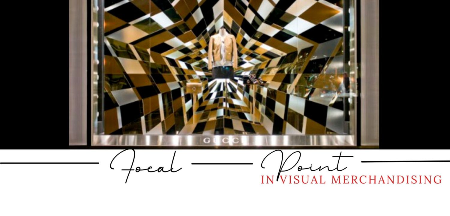
Focal Point: A focal point is the main attraction in a visual display that draws the customer’s attention. Retailers should use a focal point to create a sense of intrigue and curiosity. For example, a mannequin wearing a stylish outfit can be used as a focal point to showcase the latest fashion trends.
Dominance: Dominance is the use of a dominant element to create a focal point in a display. Retailers should use dominance to create a sense of importance and make products stand out. For example, a product placed on a pedestal or displayed in a glass case can be used to create dominance.
Site Lines: Site lines are the lines of sight that customers follow when entering a store. Retailers should use site lines to draw customers’ attention to specific areas and products. For example, displays should be placed at the end of aisles or near the entrance to create a strong visual impact.
Visual merchandising is a vital aspect of retail that can greatly enhance a store’s aesthetic appeal and create a unique shopping experience. Retailers should carefully plan their visual merchandising strategies and use various techniques, such as colors, light, promotional displays, focal point, departmental transitions, visual hierarchy, dominance, and site lines, to create an impactful display that will attract and engage customers.
Other Key Terms:
- What is visual merchandising
- Key elements of visual merchandising
- Visual merchandising directive example
- Visual merchandising terminology
- Visual merchandising techniques
- Merchandising terms and definitions
- Importance of visual merchandising
- Merchandising terminology pdf


