Elevation with Prada
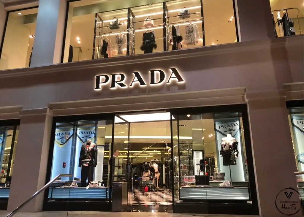
Short Description: Prada Honolulu Kalakaua
Location of Photo: 2174 Kalakaua Ave, Honolulu, HI 96815
Company: Prada
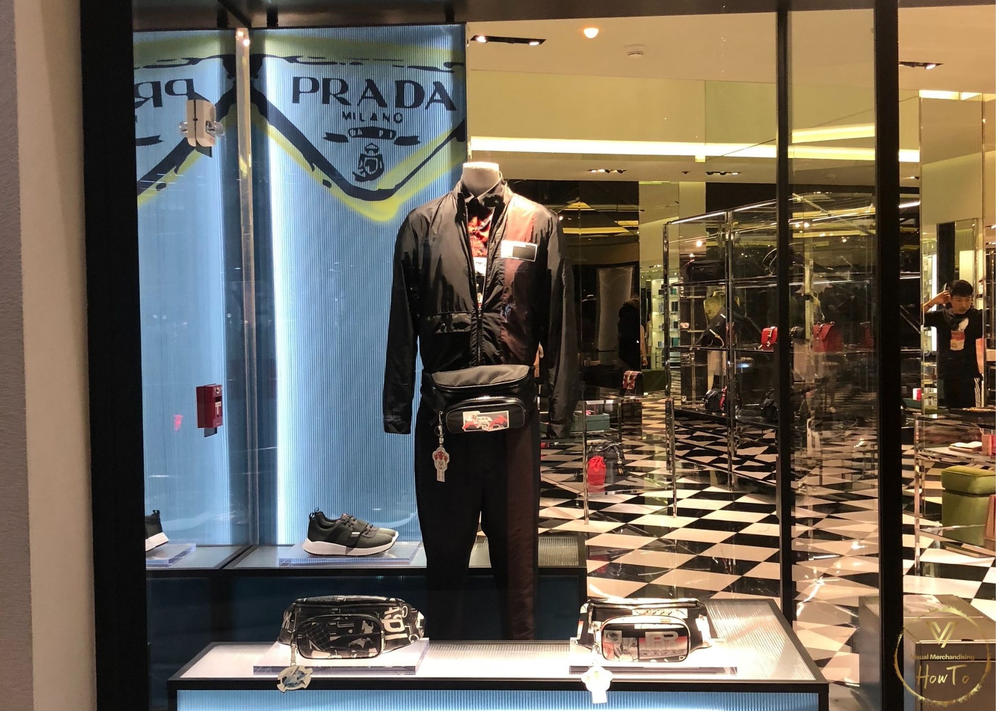
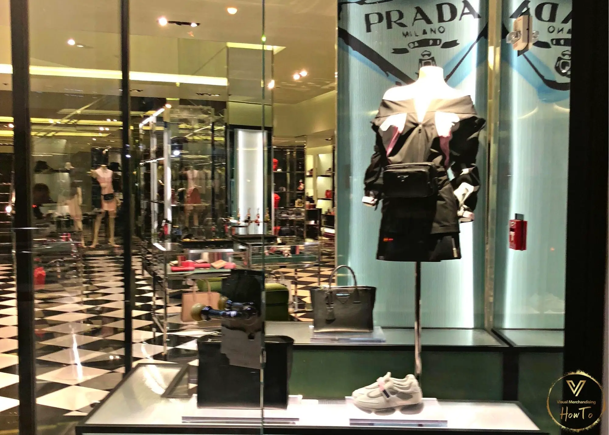
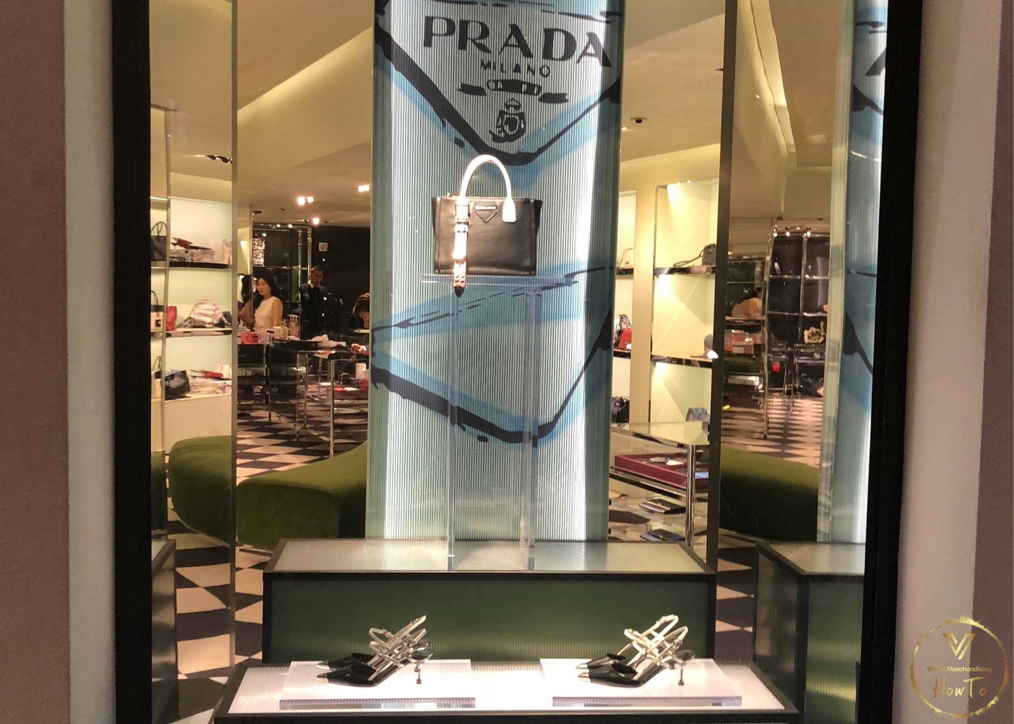
The following elements are the expressed opinions of the VMHT editor(s). They are not right, they are not wrong, they are opinions! We would love to hear yours in the comments below! Thank You.
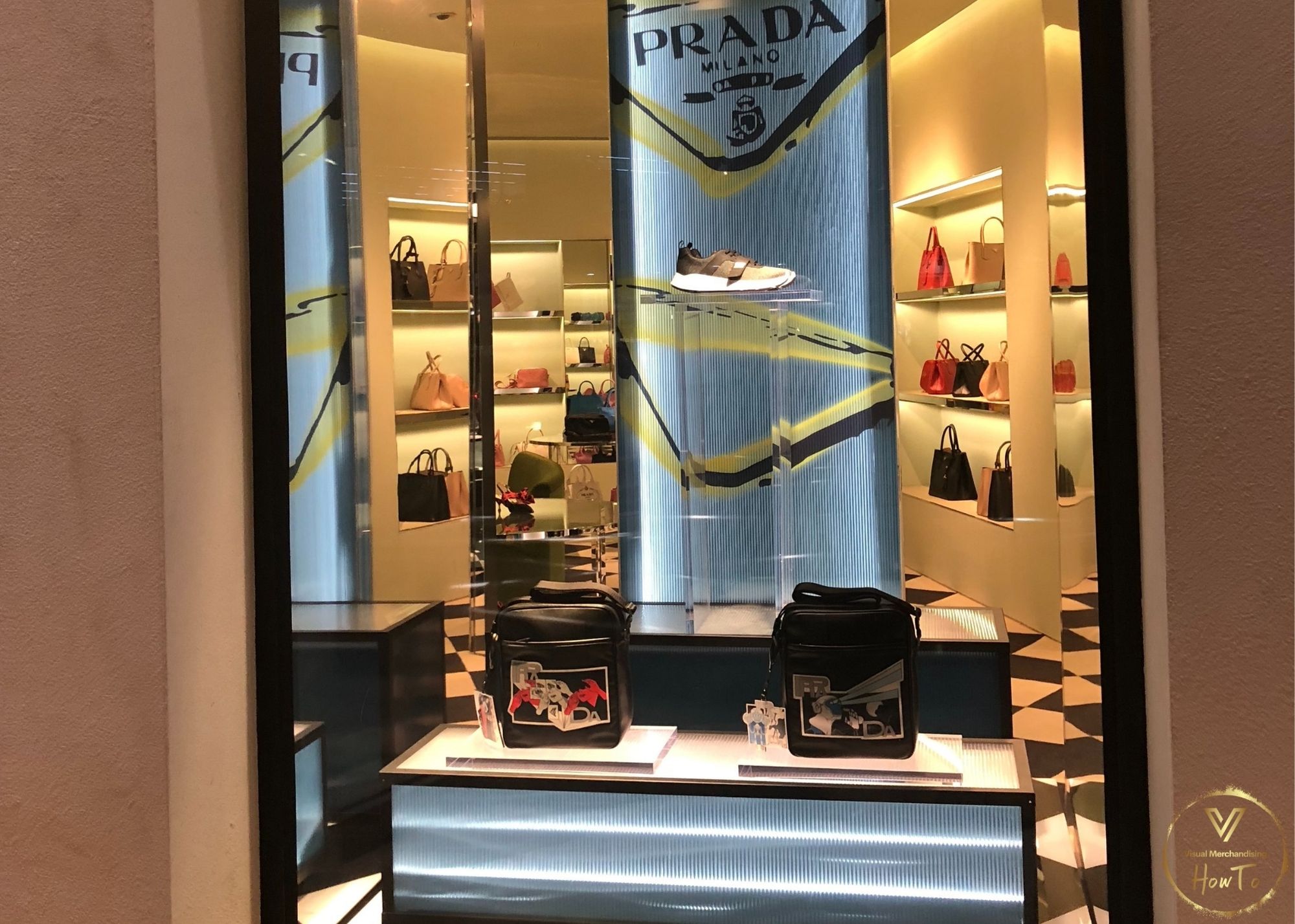
Element 1: Monochromatic color scheme black and white as well as adding in color ways of blue.
Element 2: Smooth texture in terms of the fabrics and lighting in each window display. The bright lights allow for a reflecting glow and sheen on each product.
Element 3: Vertical line is seen within each window display. The vertical line elongates each window with help from the elevated platform each display is shown on.
Element 4: Shape used in each window is a square or rectangle. The Prada signage in the background, the squares the products sit on, the elevated boxes, along with the black and white checker board tile are what make it possible to see the main shape within these displays are squares and rectangles.
Design Principle: Dominance composition with the use of vertical lines and height to display emphasis on specific items.
Conclusion: The first floor Prada window display shows a semi closed window display and elevation in terms of the platforms each product is visible on. As for the second floor window displays those window show open back window displays. In terms of balance the store shows asymmetrical balance in each window display. The vertical lines ensure for a cohesive monochromatic display throughout the two stories. The window display of shoes and handbag shows a dramatic focal point emphasis on the handbag. Lastly, the focal point in the window displays with the mannequins are those forms displaying the garments of Prada with the highlighting emphasis on said mannequins.


