Artistic Disney and the Rule of Three
World of Disney

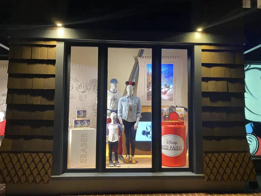
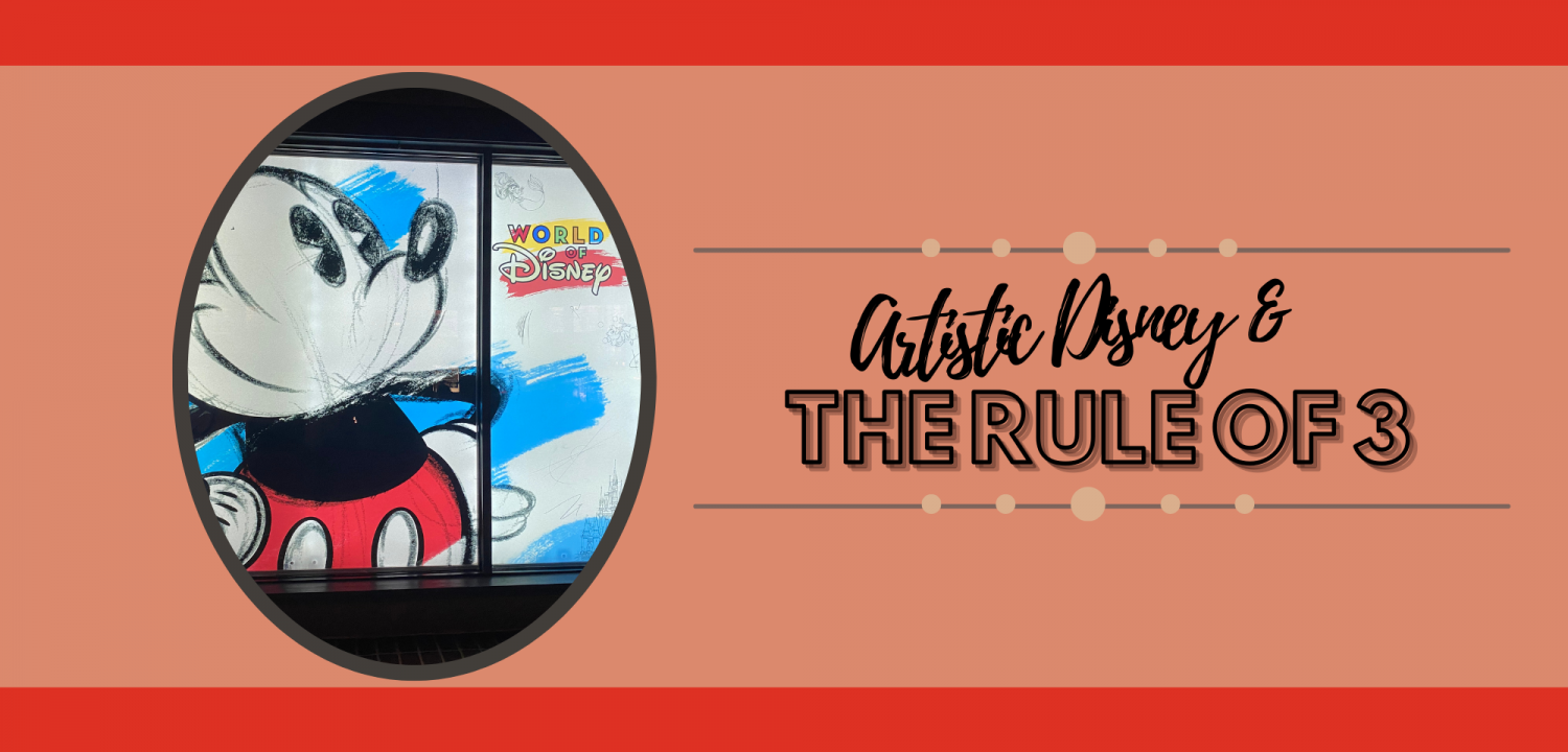
Short Description: Just in time for the 50th Anniversary of DisneyWorld. This window display showcases the artistic side of Walt Disney in his creation of Mickey Mouse. Through sketches and pieces used to create the infamous Mickey Mouse of Disney!
Location of Photo: Disney Springs, Orlando, Florida
Company: World of Disney
The following elements are the expressed opinions of the VMHT editor(s). They are not right, they are not wrong, they are opinions! We would love to hear yours in the comments below! Thank You.
Element 1: Monochromatic Color Scheme with the black, white and red
Element 2: Vertical Line which allows the eye to look up and down to see the entire window
Element 3: Proportion the props are much larger than the size of the mannequins which is opposite of reality since the props shown (such as the eraser) are normally much smaller to humans!
Element 4: Flat or Smooth Texture
Element 5: Geometric Shape is circular and rectangular. You can see the the circles within the display on the sketchpad with the drawings of Mickey, the Mickey ears on the two mannequins, rounded shoes, and logos with circles. You can also see the rectangle shape in items such as the eraser, notepad, and frame.
Design Principle: Symmetrical Balance
Conclusion: A sketch pad with hand drawings exhibiting Mickey Mouse, eraser and a jar with the infamous red paint utilized for his clothing is the epitome of of this window display. There is symmetrical balance within the frame of the window with the eraser and jar of red paint of equal sizing on both the right and left side is showcasing symmetry in the display. The rule of three is also being shown in this display. You can see that being demonstrated with the three puzzles on the eraser, three mannequins, three games on the red paint, and three visual representations as the backdrop: the sketch pad, film reel with Minnie, and the second sketch pad with Hawaiian holiday Mickey. The proportion of the props compared to the mannequins draws the eye to focus on the clothing items for sale on the mannequins.


