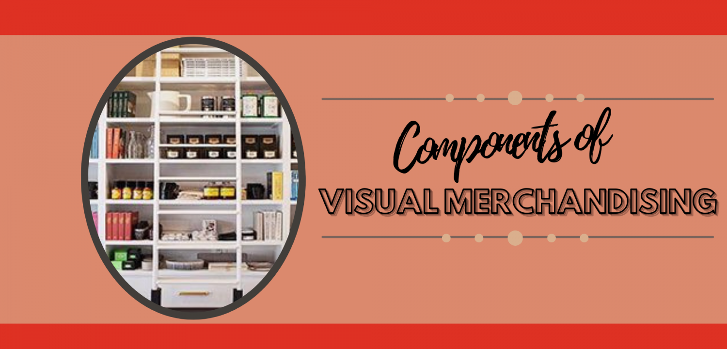
Components of Visual Merchandising
There are several main components of visual merchandising commonly known as the main elements and principles. Here we will discuss what they are and dive into each one throughout this website.
The main elements of visual merchandising consist of and not limited to the following: color, line, proportion, shape, and texture. Within the utilization of these elements there is also the use of lighting, fixtures, displays, signage, interior design, store layout and maintenance. The use and combination of all these elements help create visually appealing window and store displays which are effective in terms of creating an attractive display which showcase a story for products, increase sales, expand on the brand identify of the business.
What does it mean to incorporate the main elements of visual merchandising?
COLOR
To showcase an understanding of color theory in relation to providing a visual representation that aligns with the following color schemes: analogous, monochromatic, complimentary, double complimentary, split complimentary, neutral or triadic.
What are the various color schemes?
- Analogous: Consists of colors that are next to each other on the color wheel.
- Monochromatic: Taking one color from its deepest shade to the most light tint. You do this by adding black and white to the main color.
- Complimentary: Taking colors that are at the directly opposite location on the color wheel such as red and green.
- Double complimentary: Taking two to four complimentary colors and design with them these can include colors such as blue and orange and red and green.
- Split complimentary: Taking three colors with the primary color having two colors adjacent to each other on the color wheel.
- Neutral: Color scheme consisting of one color. Examples are all beige, white, brown etc.
- Triadic: Taking colors that are equally distant from each other on the color wheel. Such as yellow, blue and red.
LINE
The direction in which you are composing the merchandise. There a variety of lines used in merchandising they are: curve, diagonal, horizontal, and vertical.
What are the various lines?
- Curve: Portrays femininity. Normally a circle or sphere shape.
- Diagonal: Portrays intense action or excitement. Normally a line portraying movement.
- Horizontal: Low line used to portray a serene environment.
- Vertical: Line that is showcased from the floor to the top of the ceiling portraying height and strength.
PROPORTION
Designing within the correct scale of shapes, sizes and weights of products within the display. The composition will look evenly distributed amongst the entire display.
TEXTURE
The feeling in which the display is conveying. The use of light showcases whether the product is shiny, rough, scaly etc.
SHAPE
The boundaries and placement of the products.
LIGHTING
Conveys the mood you are looking to create. Spot lights highlight products whereas the use of more ambient lighting throughout the store to create a cohesive shopping environment.
FIXTURES
When utilizing fixtures there are a variety in which one may use. They are as follows but not limited to: clothing racks, display cases/counters, fitting rooms (also including hangers, hooks, mirrors etc.), mannequins, mirrors, shelves.
DISPLAYS
Where you tell a story in regards to the merchandise or products you are selling. Displays use mannequins and modular fixtures to rearrange and merchandise with ease to showcase similar products that have complementary items.
SIGNAGE
Is key when creating merchandising displays as they are what allows the consumer to understand the story behind the products in terms of pricing, promotion etc.
INTERIOR DESIGN
Interior design consists of four main components: decor, flooring, furniture and wall coverings.
STORE LAYOUT
Vital to visual merchandising. It showcases the merchandise and products in a manner that flows cohesively with the foot traffic of your store. When designing your store layout there are a few key points to keep in mind:
- How you want to lay your merchandise
- Utilizing sections or islands
- Lighting
- Signage
- Displays
- The foot path you want your customers to follow
- Utilizing planograms and planogram software such as:
- DotActiv
- GoPlanogram
- PlanoGraphics
- SmartDraw
Maintenance of merchandise occurs either weekly, biweekly etc. This is based upon the type of display and foot traffic by the display. This includes adjusting any fallen merchandise or signage, cleaning of doors, walls, registers vacuuming or sweeping of the floors, dusting shelves and mannequins along with disinfecting any surfaces one may have touched.
What are the display principles of visual merchandising?
The display principles of visual merchandising include balance, competition, dominance, repetition, and rhythm. Of course visual merchandising can showcase other design principles not listed however for the sake of this site we will be focusing on these main principles.
- Balance: Arranging of elements equally in a display by weight. Being proportionate in terms of weight. Designers will use asymmetrical and symmetrical balance.
- Asymmetrical balance: Weight and space of the elements distributed equally however they are not identical to one another. Achieving this form of balance creates a more interesting display and is more difficult to be successful at. Usually used for active wear and sportswear.
- Symmetrical balance: When the elements set with an equal amount of space and weight distributed between them. Also known as a mirror of one another. Higher price point merchandise normally use symmetrical balance.
- Composition: The manner in which the products displayed. The various lines, shapes, textures and positions of the products help relay the message in which the merchandiser is trying to convey to the consumer.
- Dominance: The placement of an element where the consumers eye goes directly to that product. Focal point of the display where it takes precedence over any other product within the display.
- Rhythm: Showcases the movement of the products to the viewer. The merchandiser is allowing the viewers eye to move cohesively through the display from one side to the other.
- Repetition: The placing of products repeatedly throughout the display. Ranges anywhere from same color, line, shape to the repetitive placement of same garment or product.


